Ever spent hours arranging the perfect bouquet, only to feel something’s off? Or maybe a customer liked the flowers, but didn’t love them. It’s a common struggle in floristry, creating arrangements that don’t just look good, but connect emotionally and leave a lasting impact. Many florists also grapple with blending colours that suit different occasions, client preferences, and cultural sensitivities, especially in a dynamic market like Singapore….
This is where colour theory becomes a game-changer. By understanding how colours work together and the emotions they convey, florists can transform ordinary arrangements into stunning works of art. From vibrant anniversary flower bouquets to soothing sympathy tributes, the right colour palette can speak volumes without saying a word.
In the upcoming section of this guide, we’ll explore:
- The science behind the colour wheel and how florists can use it to achieve visual harmony.
- How colour trends influence floral design in Singapore’s unique market.
- Powerful combinations that evoke specific emotions for weddings, condolences, celebrations, and more.
- Expert florist techniques to add depth, contrast, and flair using advanced colour pairing.
Whether you’re new to floral design or looking to sharpen your skills, this guide will help you unlock the secrets to creating show-stopping floral arrangements.
The Science Behind Colour: Understanding the Colour Wheel for Florists
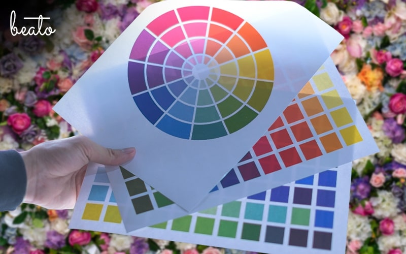
Before we jump into complex palettes and trend-driven combos, it’s important to first lay a solid foundation. Let’s start with the basics, because to truly master floral design, you need to understand the beating heart of colour theory in floristry, the colour wheel. Think of it as your design compass that helps you decide which shades to pair and why those combinations work visually and emotionally.
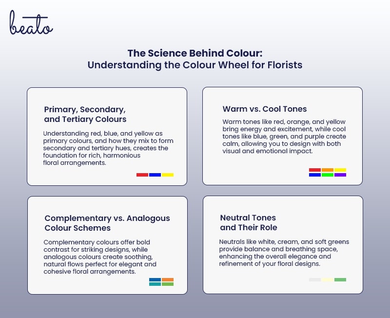
1. Primary, Secondary, and Tertiary Colours
Everything begins with the three primaries: red, blue, and yellow. These form the foundation of all other hues. Mix two of them, and you get your secondary colours—green, orange, and purple. Blend a primary with a neighbouring secondary, and you get tertiary shades like red-orange or blue-green. These nuanced hues are what give your arrangements richness and dimension.
When you use colour theory to combine these groups, your flower bouquets take on a more refined and harmonious feel. It’s like having a recipe for beauty—one that helps you avoid clashing tones and awkward transitions.
2. Warm vs. Cool Tones
Colours don’t just look different, they feel different. Warm tones like red, orange, and yellow radiate energy and excitement. They’re perfect for celebratory arrangements or bold centrepieces. Cool tones like blues, greens and purples exude calm and serenity, ideal for elegant events or sympathy pieces.
When you understand this warm vs. cool dynamic, you can start designing with the occasion and emotion in mind. That’s what makes colour theory so powerful, it doesn’t just guide visual choices, it supports emotional storytelling too.
3. Complementary vs. Analogous Colour Schemes
Want to create contrast? Go for complementary colours, those sitting opposite each other on the wheel (like yellow and purple). Using them together creates high visual impact, perfect for statement bouquets or festive holiday designs. Analogous colours, meanwhile, sit side by side on the wheel like blue, blue-green, and green. These combinations feel more natural and soothing, ideal for weddings or elegant home décor.
These schemes help you decide whether you want your designs to pop or flow. It’s all about using colour theory to guide the mood of your arrangement.
4. Neutral Tones and Their Role
Lastly, don’t underestimate the power of neutrals like white, cream, beige, and soft greens. These shades balance bright blooms and offer breathing space in a design without overwhelming the eye. They’re especially useful in minimalist or high-end arrangements where subtle elegance is key.
In short, learning how to work with the colour wheel is like learning the language of floristry. Once you get the hang of this colour theory, your arrangements won’t just be beautiful, they’ll tell a colour-driven story through shades, tones, and emotional cues.
How Colour Trends Shape Singapore’s Floral Industry
Now that we’ve explored the foundations of colour theory and how the wheel works its magic, it’s time to see how all of that translates into real-world floristry, especially here in Singapore, where diversity meets design trends head-on. In this dynamic market, staying current goes beyond just keeping flowers fresh. It’s all about knowing what colours people are drawn to and why.
1. Seasonal and Cultural Influences on Colour Trends
Singapore’s multicultural celebrations play a big part in shaping floral colour choices. For example, during Chinese New Year, you’ll find a surge in red and gold arrangements, symbols of prosperity and luck. Deepavali often calls for bright, rich hues like orange, fuchsia, and yellow, reflecting the festive spirit. Meanwhile, Hari Raya arrangements might favour whites, greens, and soft pastels for their elegance and purity.
Understanding colour theory helps florists craft arrangements that honour these traditions while still appealing to modern tastes. By balancing culturally significant shades with smart design, you can create arrangements that are both meaningful and visually compelling.
2. Wedding and Event Trends
Gone are the days of one-size-fits-all wedding palettes. Today’s couples are drawn to a mix of earthy neutrals, blush-toned pastels, and daring pops of colour in their florals. Think muted taupes paired with dusky roses or terracotta with dried elements for that rustic-luxe feel.
These trends don’t just happen, they’re rooted in colour theory. Knowing how to layer subtle tones or add contrast with a single bold bloom can elevate a bridal bouquet from basic to breathtaking. Event floristry is all about atmosphere, and colour plays a leading role in setting the tone.
3. Social Media and Aesthetic Trends
Platforms like Instagram and Pinterest are changing the game. Florists often get requests based on saved posts or moodboards, with clients asking for “that Pinterest-perfect pink” or “those trending lilac hues.”
So, when you understand colour theory, you can interpret those vague requests with confidence. You’ll know how to recreate a vibe even if the exact shades aren’t available, and how to tweak tones to flatter different flower types and lighting.
4. Luxury vs. Everyday Arrangements
High-end floral styling tends to lean into soft, washed-out palettes like champagne roses, pale blue hydrangeas, or ivory peonies. These muted tones feel refined, timeless, and are easy to pair with any decor.
In contrast, birthday flower bouquets or “just because” arrangements often burst with energy like vivid pinks, sunny yellows, electric blues. These bright combinations evoke joy and spontaneity, perfect for making someone smile.
Whether you’re designing for luxury or fun, colour theory helps guide your choices so each bouquet speaks the right emotional language. It’s the secret behind arrangements that not only look good, but feel right, too.
Colour Combinations That Evoke Emotion and Meaning
When it comes to choosing the right flowers, it’s not just about what looks pretty, it’s about what feels right. Whether someone’s ordering flowers to say “I love you,” “Congratulations,” or “I’m sorry,” every hue carries a message. This is where colour theory truly shines, helping florists communicate feelings through design.
Here’s how.
1. Colours for Different Occasions
Every occasion comes with its own colour palette. For weddings, soft pastels like blush, cream, and dusty rose express romance and tenderness. In contrast, funeral flower arrangements tend to favour muted whites and greens, reflecting peace and reverence. Looking to celebrate a birthday? Bright pops of yellow, orange, and pink spark joy and energy.
Corporate events often lean into sleek, minimal palettes, think white orchids or blue hydrangeas for a polished and professional feel. Meanwhile, celebrations like anniversaries or baby showers call for personalised combinations that reflect the tone of the event and the recipient’s style.
2. Emotional Impact of Different Hues
Thanks to colour theory, we know that colours trigger specific feelings. Red adds a bold burst of passion or love, while blue is calming and thoughtful. Yellow is naturally uplifting and joyful, and purple brings a touch of mystery and luxury. Each hue can influence how a bouquet is received, which makes intentional selection so important.
3. Monochrome vs. Multicolour Arrangements
Monochrome arrangements, where one shade takes centre stage, bring elegance and cohesion, often used in modern or formal settings. On the other hand, multicoloured bouquets brim with vibrancy and charm, ideal for casual gifts or festive occasions. Applying colour theory here helps balance tones and prevent visual overwhelm.
4. Cultural Meanings of Colours in Singapore
In Singapore, colour meanings can shift depending on context. Red is a staple for good luck and celebration, especially during the Chinese New Year or weddings. White, while serene, is typically reserved for mourning. Gold symbolises wealth and success, frequently seen in business-related floral gifts.
By blending emotion, intention, and cultural awareness, colour theory allows florists to create bouquets that are beautiful, meaningful, and perfectly suited for every moment.
Florist Secrets: Advanced Colour Pairing Techniques
After learning the emotional impact and cultural relevance of colour, it’s time to take things a step further. This is where experienced florists take the spotlight by bending the rules of colour theory and getting creative with advanced techniques that elevate any bouquet from beautiful to unforgettable.
1. Unexpected Colour Pairings That Work
Breaking the rules can lead to some of the most eye-catching results. Think earthy terracotta roses paired with delicate lilac, or deep emerald foliage alongside soft blush tones. Jewel hues like ruby or sapphire, when softened with greys or taupes, add drama without overwhelming the senses. These combos work because they play on contrast and balance, two essential pillars of colour theory.
2. How Lighting and Background Affect Colour Perception
Florists also consider where an arrangement will live. Natural light enhances warmer tones, making reds and oranges appear more vibrant. Cooler shades like blue and lavender, on the other hand, can take on a moody tone under artificial lighting. Backgrounds matter too as a bouquet against a dark wall may need lighter, brighter blooms to pop. Understanding these elements is just another layer of applying colour theory effectively.
3. Creating Depth with Colour Layering
To give the arrangements a more dynamic feel, florists often build depth by layering. Start with rich, dark blooms at the base, then gradually lighten the tones as you move outward. This gradient effect creates visual interest and a subtle 3D illusion that draws the eye in.
4. Using Foliage and Accents to Enhance Colours
Foliage is far more than filler. Eucalyptus, ferns, and even dried grasses can soften bold colours or emphasise muted ones. Metallic accents like a touch of gold wire or copper-toned leaves add elegance while enhancing the vibrancy of surrounding hues. It’s all about knowing how each element complements the next, rooted in a strong grasp of colour theory.
Frequently Asked Questions
1. How can I make a floral arrangement look luxurious using colour
Luxury floral designs often use monochromatic or tonal colour palettes with subtle variations in shade. Combining deep, rich colours like burgundy or navy with soft neutrals (ivory, blush, or champagne) creates a high-end, elegant look. Adding gold or silver accents, or using premium flowers like peonies, orchids, or garden roses, also enhances the luxurious feel.
2. What are the best colour combinations for a minimalist floral arrangement?
Minimalist floral designs typically use neutral tones, such as white, cream, and soft greens, often paired with a single accent colour like dusty pink or muted blue. Monochromatic arrangements in one colour family (e.g., all-white with subtle beige undertones) also create a clean, sophisticated aesthetic.
3. How can I use colour to make flowers appear fresher and more vibrant
To enhance vibrancy, pair complementary colours (e.g., yellow and purple) to create contrast. Using dark green foliage as a backdrop makes bright flowers stand out, while arranging lighter shades in the centre and darker tones around the edges creates a fresh, blooming effect. Additionally, soft lighting and careful colour placement can prevent arrangements from looking dull or washed out.
Bring Your Flower Vision to Life with Beato Fiore
To wrap things up, mastering colour theory gives florists the creative edge to go beyond basic arrangements and craft show-stopping designs. From understanding the colour wheel to predicting trends and exploring bold pairing techniques, it all comes down to one thing: using colour with intention.
Whether you’re designing a romantic wedding bouquet, a cheerful birthday bunch, or a sophisticated corporate arrangement, colour isn’t just about beauty, it’s about meaning, mood, and message. With a solid grasp of colour theory, every stem you place becomes part of a bigger, more impactful story.
At Beato Fiore, colour is more than a detail, it’s the heart of everything we do. Our team of creative florists are experts at turning palettes into petals, delivering bespoke arrangements that feel as good as they look.
Contact Beato Fiore to learn how we turn colour theory into stunning, meaningful designs. Whether you’re planning a big event or just want to brighten someone’s day, let’s create something beautiful together.